Quickbooks
Support & Retention

Challenge
The support team at Quickbooks came to us because user retention was lower than they wanted it to be. They asked us to help them understand why the website's support section wasn’t performing and design a creative solution to fix it.
Process
After conducting thorough user interviews with existing and potential Quickbooks users, we discovered that while users were keen to self-serve in support, they were struggling to navigate the existing support section, and in many cases were unaware it was even an available resource.
Additionally, from discussions with the internal QB team, we learned users were four times more likely to use the software past their free trial if they set up certain key features within the app.
Solution
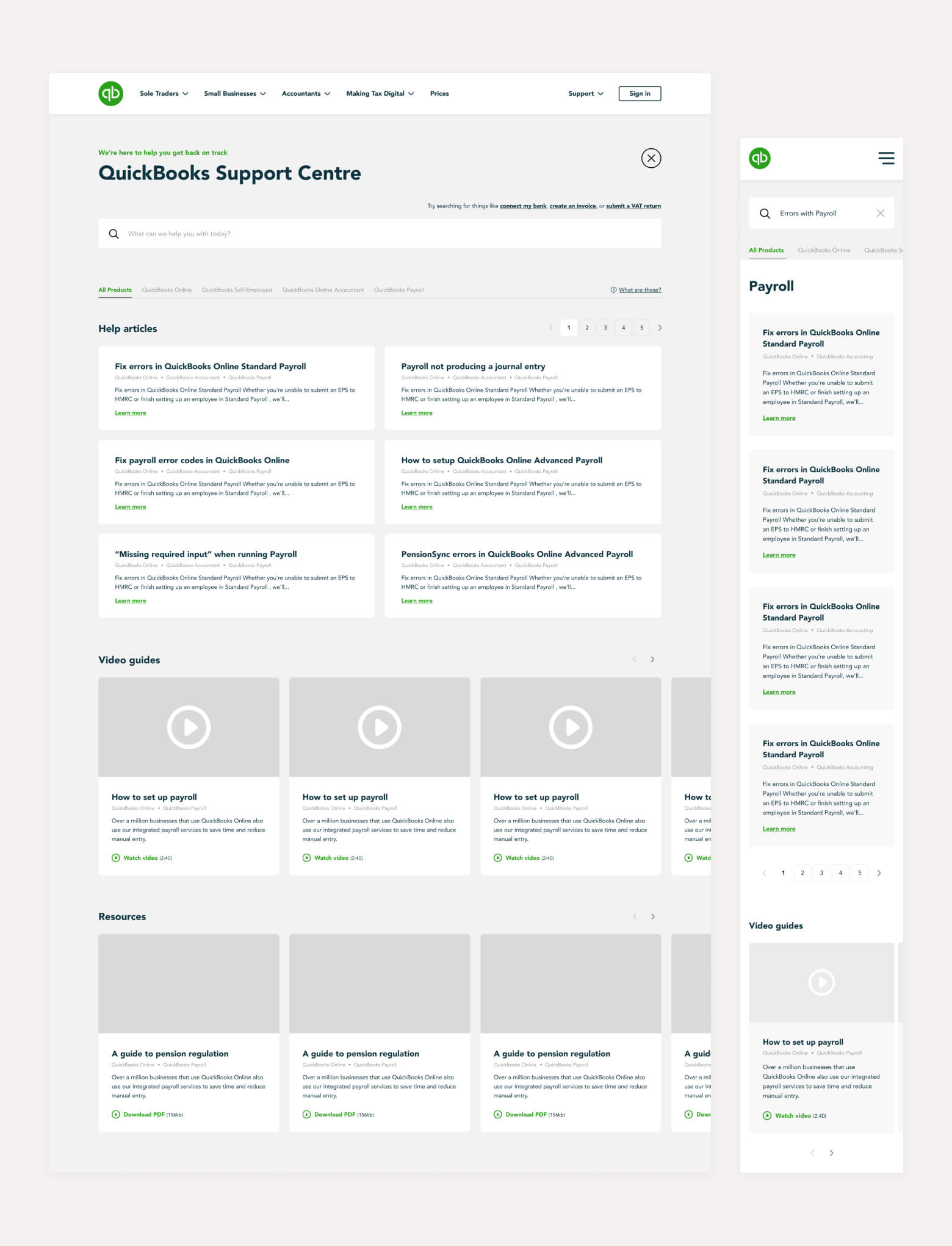
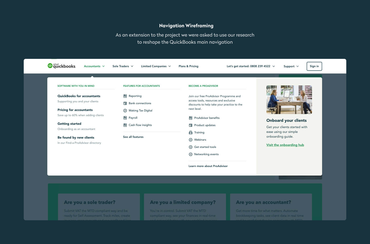
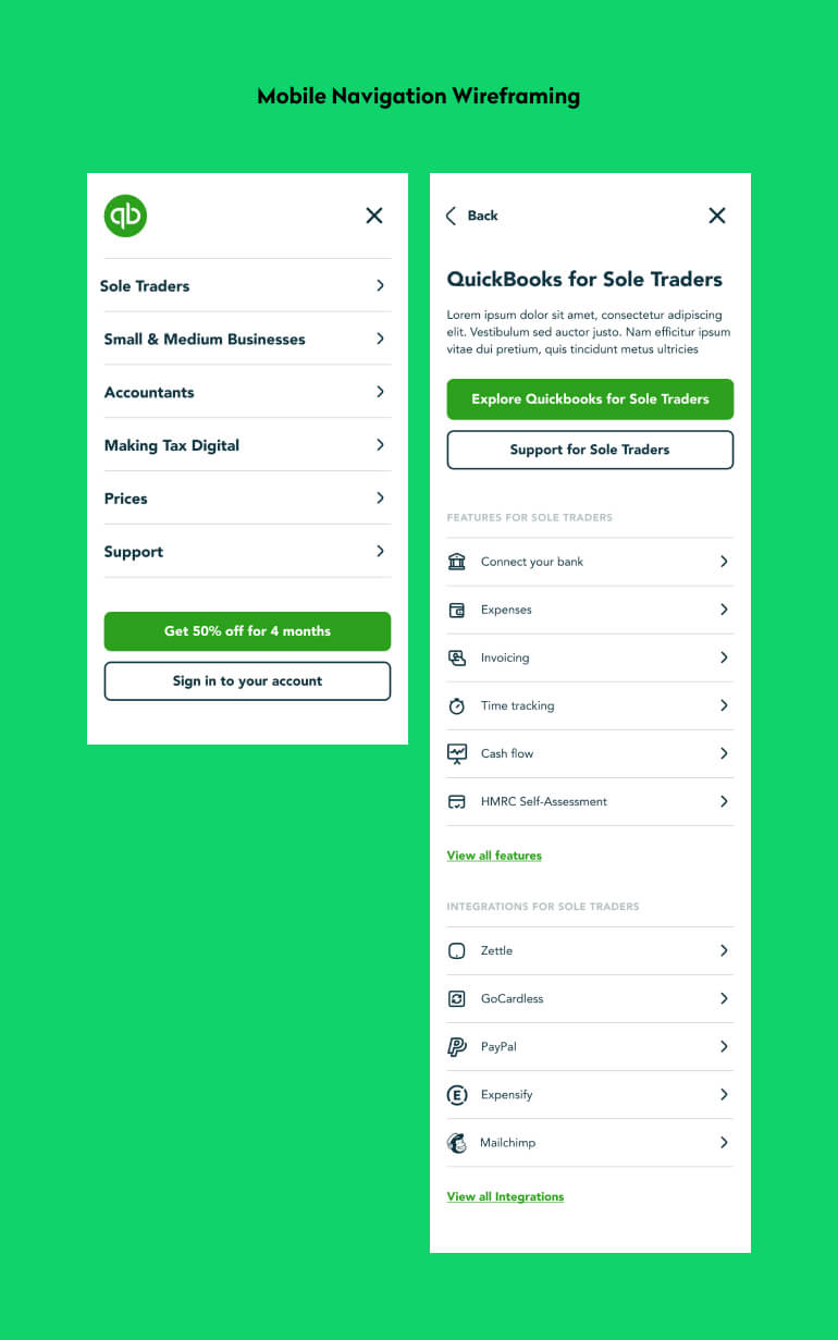
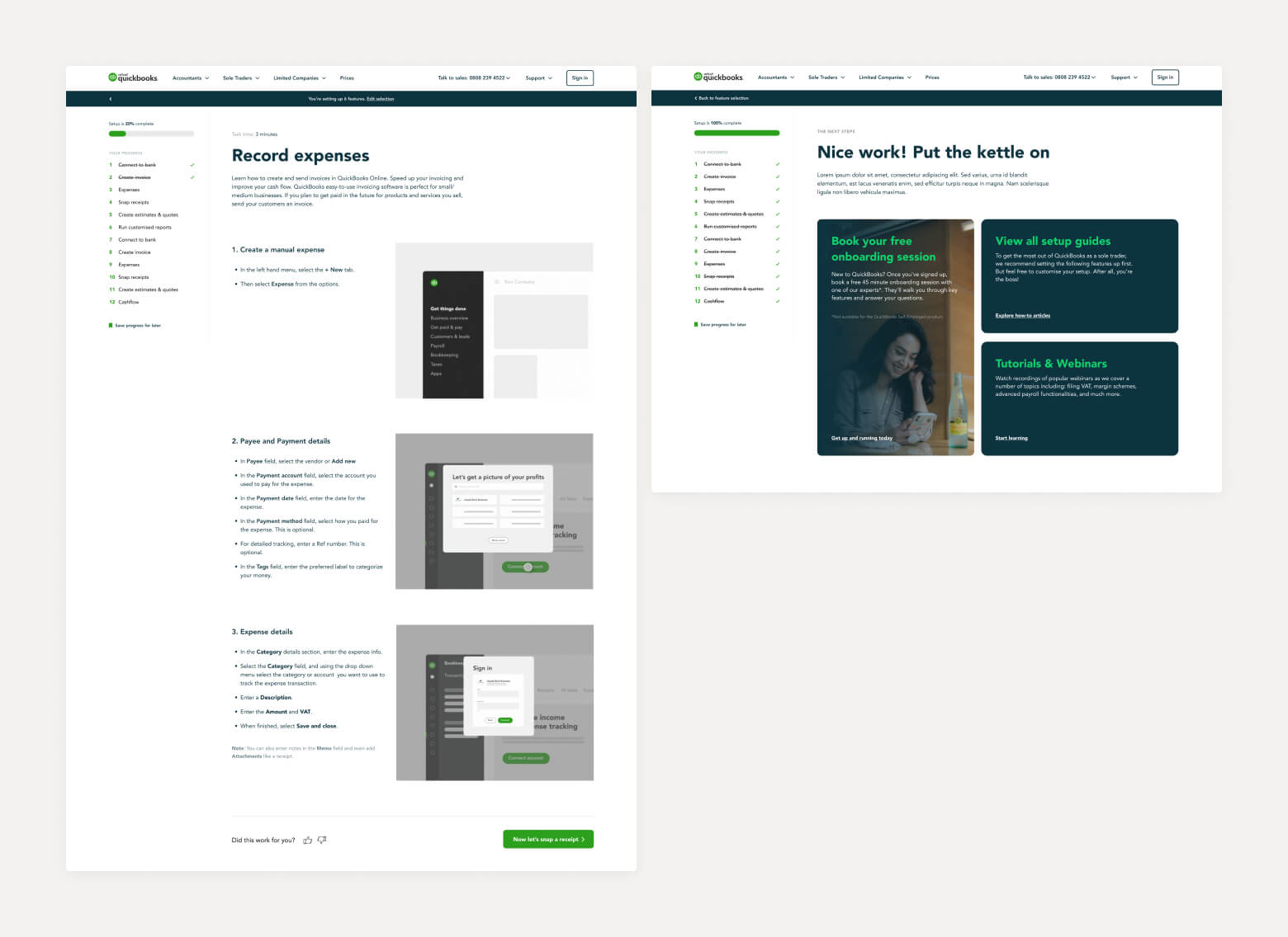
To help users resolve their support issues, we redesigned the support section to use a clear three-tier structure; landing page > category page > article. This made for a seamless experience in finding and navigating to the correct help article. We also designed subtle cues towards the support section during the acquisition funnel, so new customers built awareness of it as a resource.
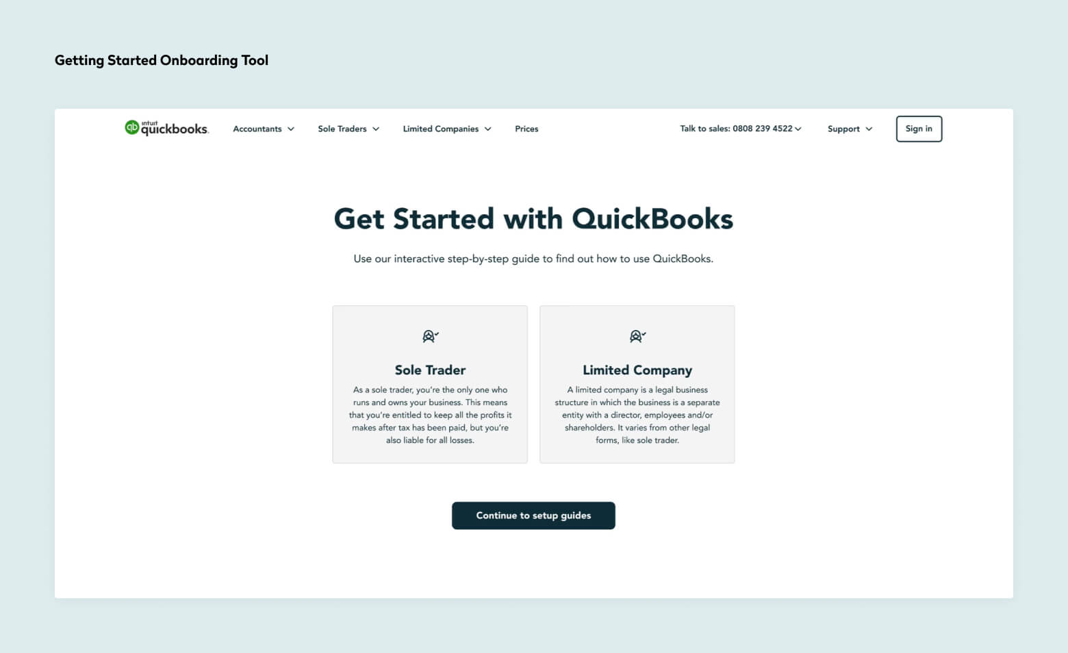
Finally, we designed a personalised onboarding tool, complete with step-by-step animated instructions to guide users through the process of setting up those key sticky features that make them more likely to stay with Quickbooks after their free trial.
- Services
- User Research
- UX Design
- UI Design
- Animation