Quickbooks
Audience & conversion

Challenge
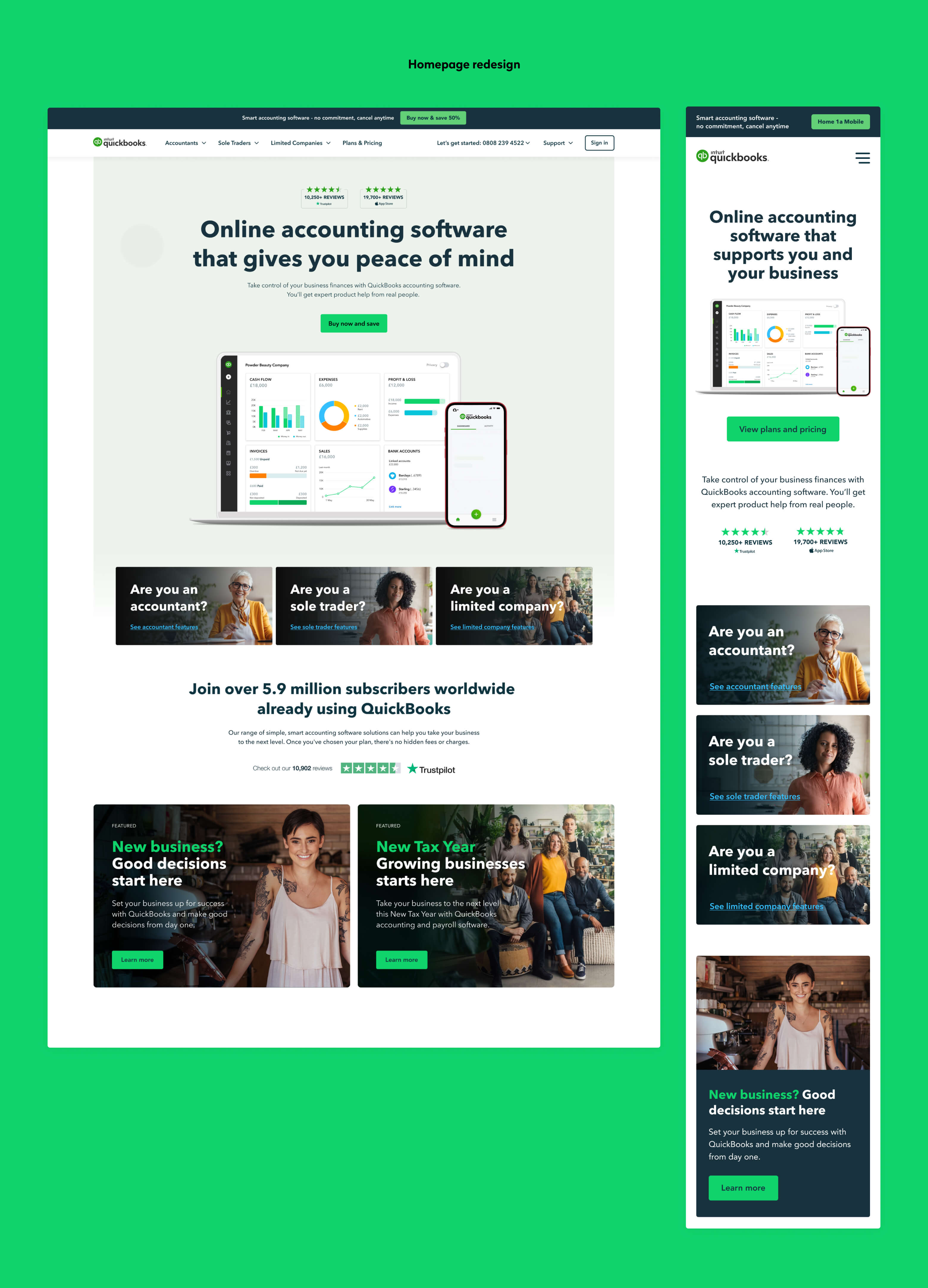
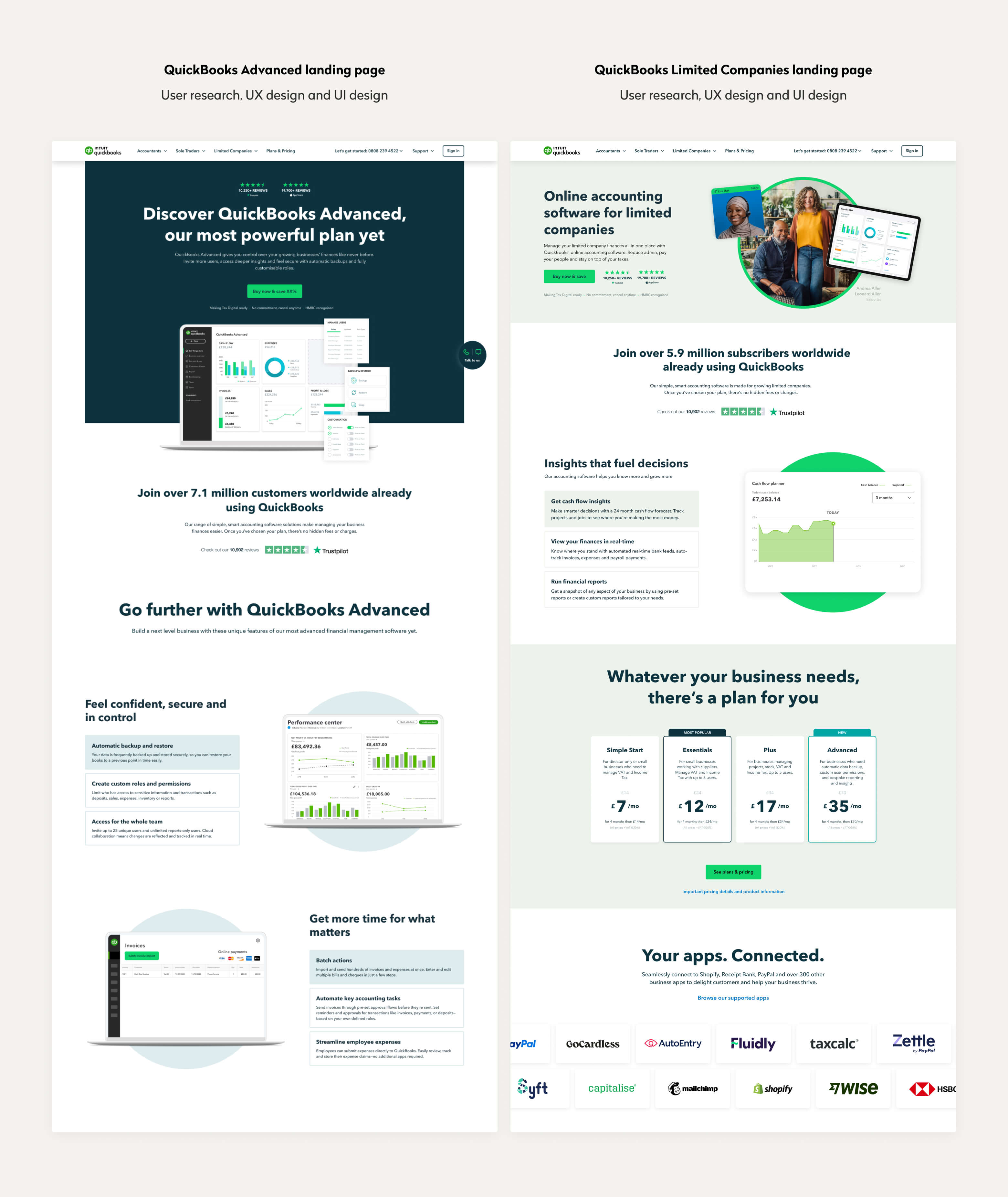
For the homepage as well as the three unique audience landing pages, QuickBooks wanted to increase conversions. They approached us to help understand where and why potential customers were dropping out and to design a unique solution to guide them through the top of the funnel.
Process
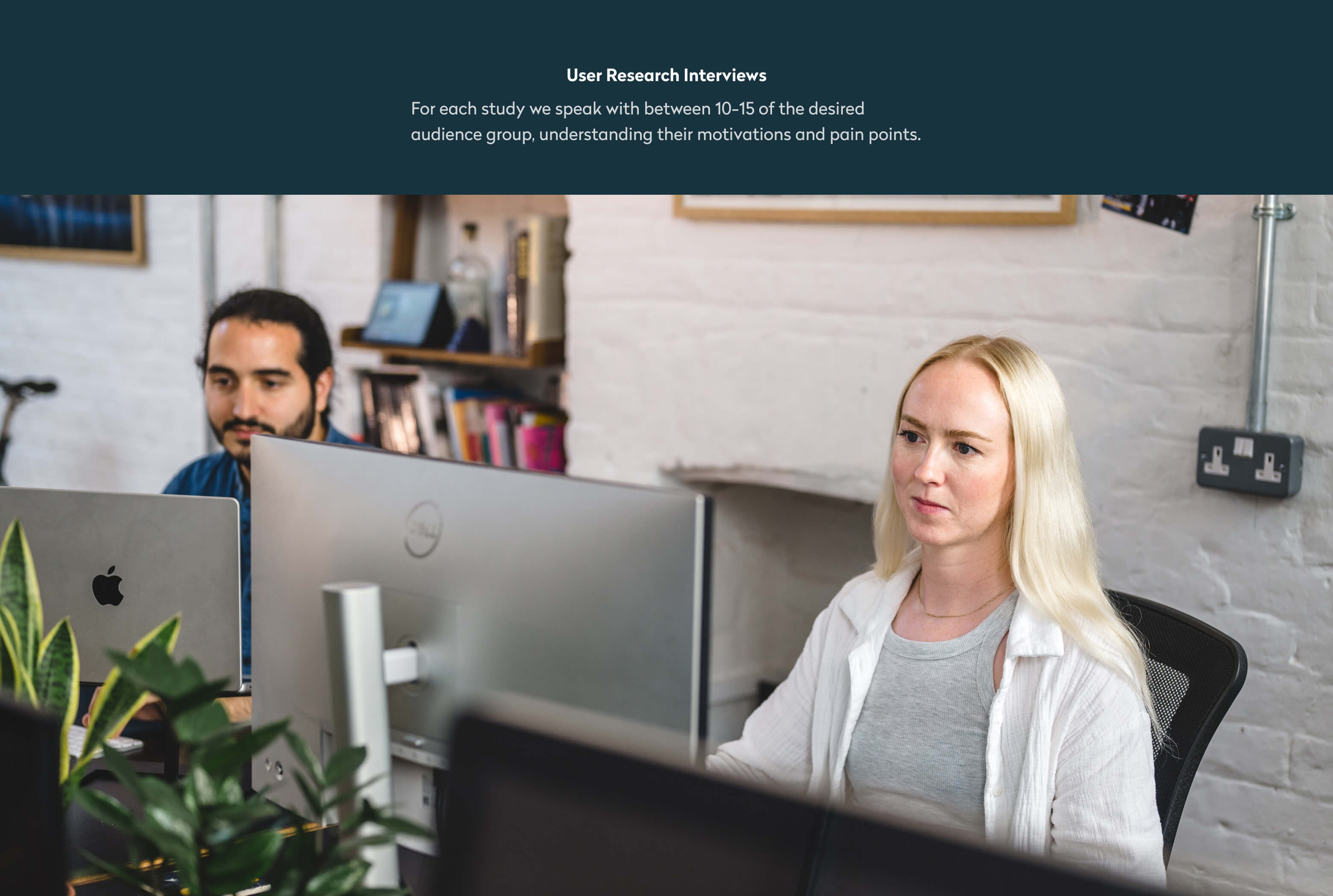
Through a series of user interviews focused on each individual user group as well as one targeted at the homepage, we gained an understanding of the most important features to users when looking for accounting software. We also noted that users were not interested in reading lots of text and were keen to see social proof.
In addition, each user group had a different level of knowledge of accounting and therefore needed a unique set of messaging to address their specific needs and concerns.
Solution
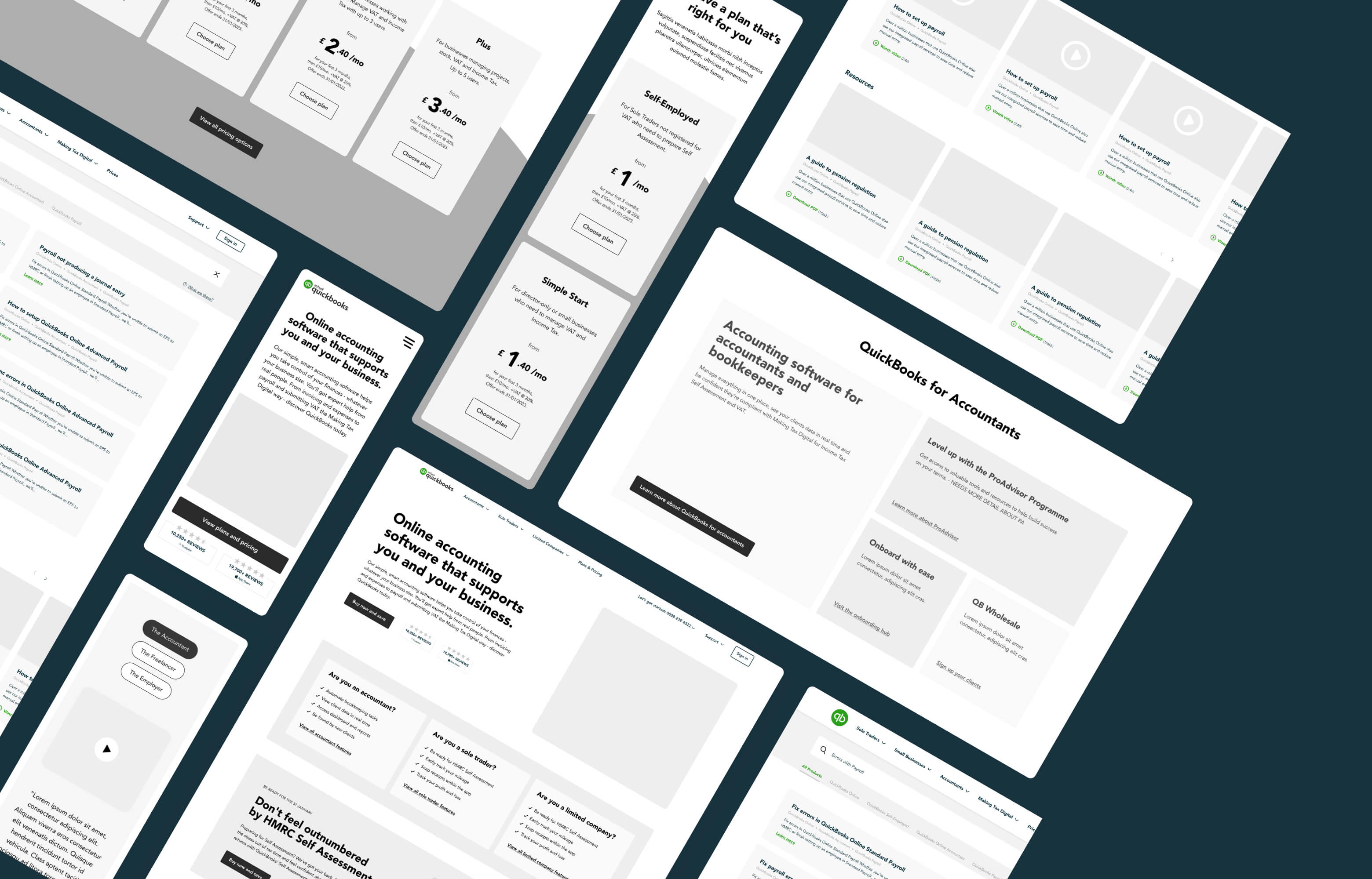
Using the insights gained from user interviews as well as analytics insights on bounce rate and scroll depth, we redesigned the key landing pages of the QuickBooks website including the Homepage, Navigation, and three key audience pages.
As part of this redesign, we proposed new messaging hierarchy and streamlined copy. We also created animated product expressions to give the page some visual interest and to help explain key features without the need for wordy explanations.
- Services
- User Research
- UX Design
- UI Design
- Animation